How to Reduce Shopping Cart Abandonment
What is Shopping Cart Abandonment?

Imagine you own your bakery. A customer comes in and takes hours to decide which cupcake he wants. You very smoothly and graciously help the customer, providing him with the best customer service. You have placed in front of him a courtier of your delectable cupcakes and the customer is showing keen interest in buying one.
But, in the spur of the moment, the customer just steps back and walks out of the door, without giving any reason. You are left not only disheartened but also in oblivion.
You are just standing there thinking:
Q1. Was it your customer service?
Q2. Are your cupcakes not that appealing?
Q3. What was it that a promising customer just walked out without any word?
This is the basic analogy behind shopping cart abandonment.
How Big of an Issue is Shopping Cart Abandonment?
Shopping Cart Abandonment is one of the biggest menaces in the e-commerce market.

If we add the capital spent on acquiring those customers through marketing and advertising, you realize that you’ve lost much, much more than you’ve grossed.
It is more troubling because there is no definite formula or strategy to completely eradicate the issue.
No amount of SEO tools or marketing tactics can help an e-commerce company to complete uproot the parasite.
Worry not! although we cannot kill the parasite it’s the effect on the host can be mitigated.
What are the Major Reasons Behind Cart Abandonment?
There can be many points, throughout the process, which can be the source of cart abandonment. But the most alarming one out of all is when abandonment happens right at the time of purchase. If the checkout process is where the majority of the cart abandonment is happening, then the issue must be dealt with full force.
Another thing to check via mapping is the reason for the said abandonment:
- Confusing design
- Bad User experience
- Lack of customer support
- Too many ads
- Technical glitch
- Server problem
- Hidden taxes and prices at the time of checkout
- Preferred payment option not available
- Confusing checkout process and many more
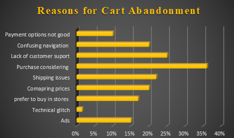
Once you have found the issue you can introduce simple tweaks to multifaceted tactics to ensure purchase.
What is the Point of Abandonment?
Before we kill the parasite, we must know where it is manifesting. A thorough analysis is required to check why and where is the abandonment happening.
As said multiple times, cart abandonment will happen. But you need not be alarmed until your cart abandonment goes above the industry average.
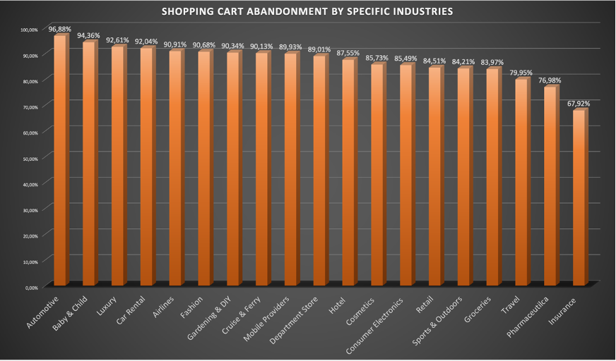
When this happens, your ‘must-go-to strategy’ should be Customer Journey Mapping.
Customer Journey Mapping
Have you seen the mechanic searching for the puncture in your tire- looking for bubbles throughout the tire? That is exactly what customer journey mapping does.
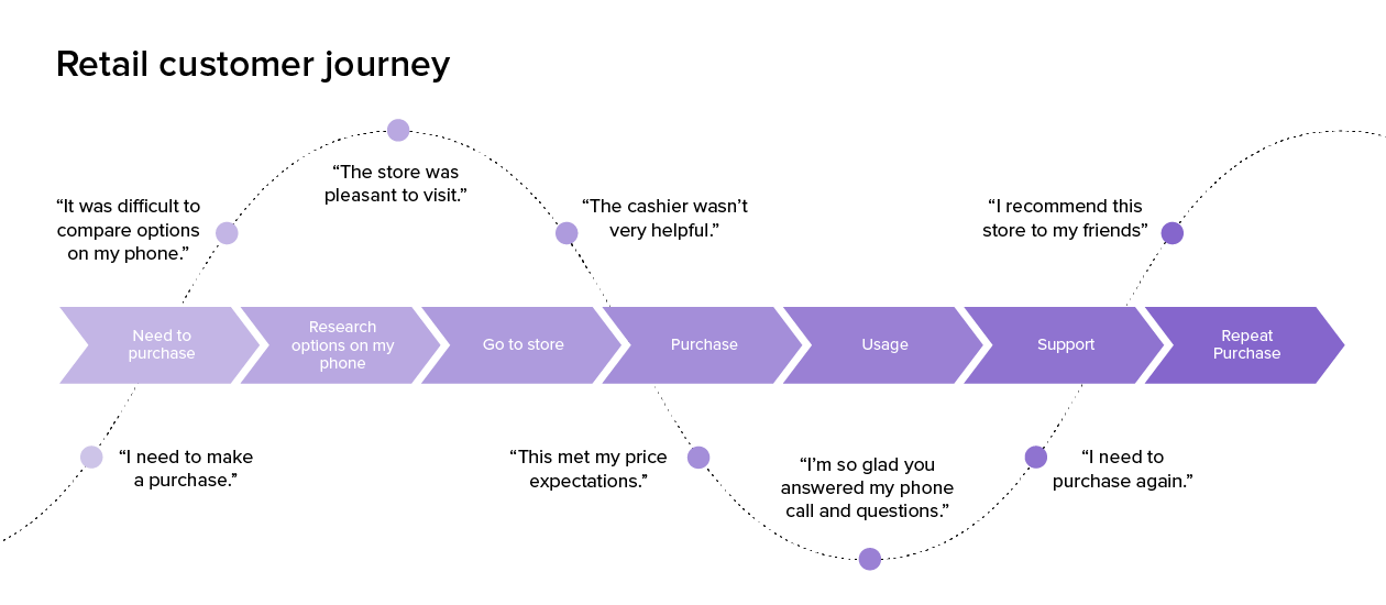
It is the process of tracking a customer’s complete process, right from the intention of purchase to the repeat purchase. This will help you to identify the source of the issue.
How to Solve the Issue?
Now that the issue is identified, the best way is to approach it from two angles:
- along with implementing tactics to mitigate the cart abandonment rate,
- focus on bringing back the customers who abandoned the cart in the first place.
Such a shopping cart recovery approach is what will make you one step ahead of your competitors.
But how to harness the potential in cart abandoners? Here are some simple yet effective ways:
1. Email Retargeting
It is like preparing for the worse and hoping for the best.
According to surveys, more than 70% of the users don’t or are unable to complete the purchase.
But do not be alarmed by this number!
Once they are gone there is still time to get them back. That is achieved via email retargeting.
Email retargeting as the word suggests is when you approach the abandoners via email services.
The abandonment could have happened for multiple reasons but if the customers are reminded about what they missed, around 56% of the shopping carts can be recovered.
1.1 When to Send the Email?
But be quick about it and maintain the frequency.
If you send an email in that golden window of 1-hour post abandonment, the chances of you getting back to the customer become go up exponentially.
If you use the correct retargeting technology and maintain the frequency for a week after abandonment, you can recover more than 85% of the abandoned carts.
1.2 The Content is the Key
Give your lost customers a reason to come back.
A reason for them to notice that email, feel tempted, come back and finish the purchase. Having fresh content, adding a hint of personalization, new deals and responsive email templates will make them realize what they are missing out on. You can add:
- Big distinctive images
- Direct link to the cart.
- Discounted prices with a slash showing the difference from the previous prices
- Create a sense of FOMO around the product
- Add a limited availability text
2. Reliable E- Commerce Platform
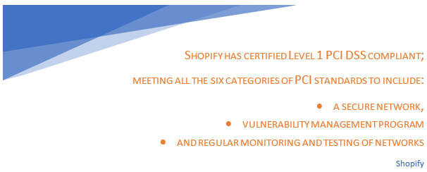
Today is the world of cyber. With every innovation, comes new problems. With so many data leaks and hacks at play, it is crucial to invest in the best, most competitive and most reliable e-commerce platform for your user to shop.
Choose according to your website’s and your user’s need. A reliable e-commerce platform will ensure not only a smooth, user-friendly experience but also keep your website’s vulnerabilities at bay.
Take Shopify for example.
3. Sign in Accounts is Not Always Productive
One of the biggest mistakes companies make is putting sign barriers. Pushing your customers to create an account to finish a purchase is not always advisable. You lose a lot of customers because of the unnecessary sign-ins.
Surveys have concluded that websites with guest logins and social sign-ins have a mitigated cart abandonment rate compared to those who force sign-ins.
Having said that, if having sign-in barriers is pivotal for some of your products, then introduce some coupons or benefits for the customers who sign in.
4. Maintain Transparency
Nothing infuriates a customer more than extra costs, especially right before they are about to tap on purchase.
Extra charges must be avoided, period!
If you are unable to avoid extra costs like shipping charges then be clear about it. A transparent cart breakdown is well appreciated by users. A typical cart breakdown includes the following:
- Cost per product
- Discount per product
- Total cost of cart
- Total discount on cart
- Taxes on the cart
- Shipping and delivery costs
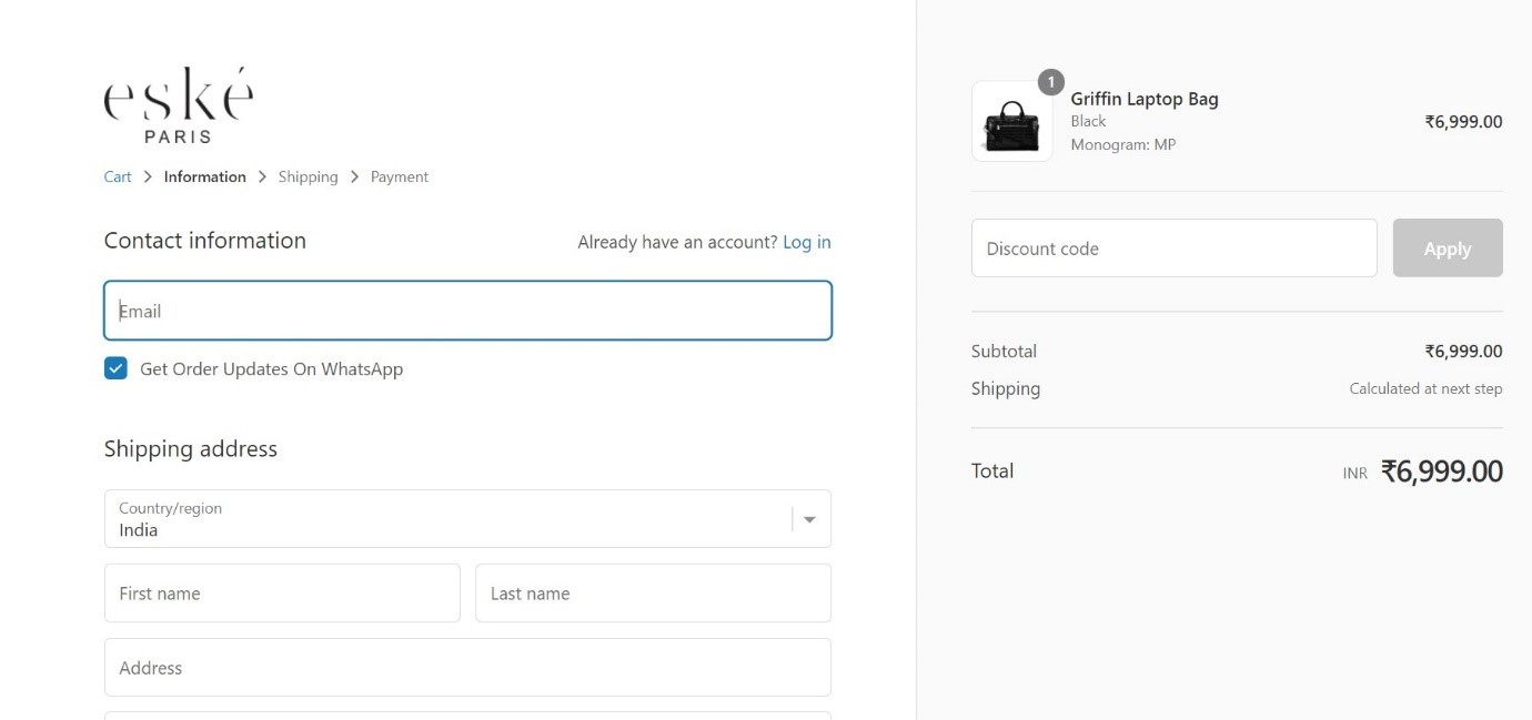
Hidden charges not only lead to cart abandonment but can also lead to the forever loss of the customer. Therefore, maintaining transparency if not complete exclusions of extra costs will mitigate the cart abandonment significantly.
5. Smooth Shopping Experience
The journey of the customer right from the moment they enter the website to the payment should be as seamless as possible.
Remember, no matter how niche or unique your product is, if the customer is not able to navigate through the website smoothly, they will be less and less motivated to finish the purchase.
Keep a track of how the user is interacting with the website- the homepage, catalogues, add to cart etc. If the customer is well engaged in your website, it is highly unlikely that they will leave the website without a purchase.
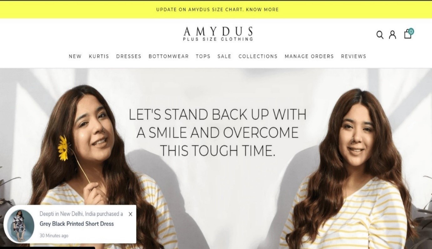
Also, the user should be able to browse, select and purchase in record time. The smoother and quicker the whole process is the smaller is the window for cart abandonment.
6. User – Friendly Payment Options
We have come a long way from having just cash and credit cards as payment options. We have digital wallets like Paytm, Google pay, Venmo; websites having their payment options like amazon pay, Flipkart pays later; and numerous other options like credit cards and of course cash on delivery, to name a few.
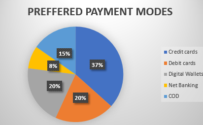
Every customer is different and has a different payment preference.
Remember to ensure who your targeted audience is and choose a payment plan according to that. Such varied payment options ensure the accommodation of a wide spectrum of audiences.
7. Mobile – Friendly User Experience
For a generation of consumers who are always on the go, their mobile user experience must be smooth and efficient.
According to the latest survey by Retail Drive, the time taken by a user to finish checkout is as less as 2.25 minutes.
Such efficient users look for an equally efficient experience. They know what they want, all you have to do is show it to them in the most time-efficient way.
You cannot have the same optimization strategy as the desktop version though.
The mobile optimization must include:
- Single-handed operations
- Multiple check out process
- Big CTA buttons and large fonts to avoid accidental taps considering it is a single-handed operation
- Auto Filling
- Digital wallets for payment
- Guest/Social Sign-ins
8. Exit Intent Popup – The Final Nudge
Even if the customer has decided to not go through with the payment, the battle is not entirely lost.
Do not just assume that the customer doesn’t want the product just because they haven’t checked out. Some customers need that final nudge and that simple nudge can go a long way.
An exit-intent popup is that nudge.
Glorify it with lucrative coupons creating a FOMO around it. You can also add limited window discounts and make it distinctive- borderline loud!
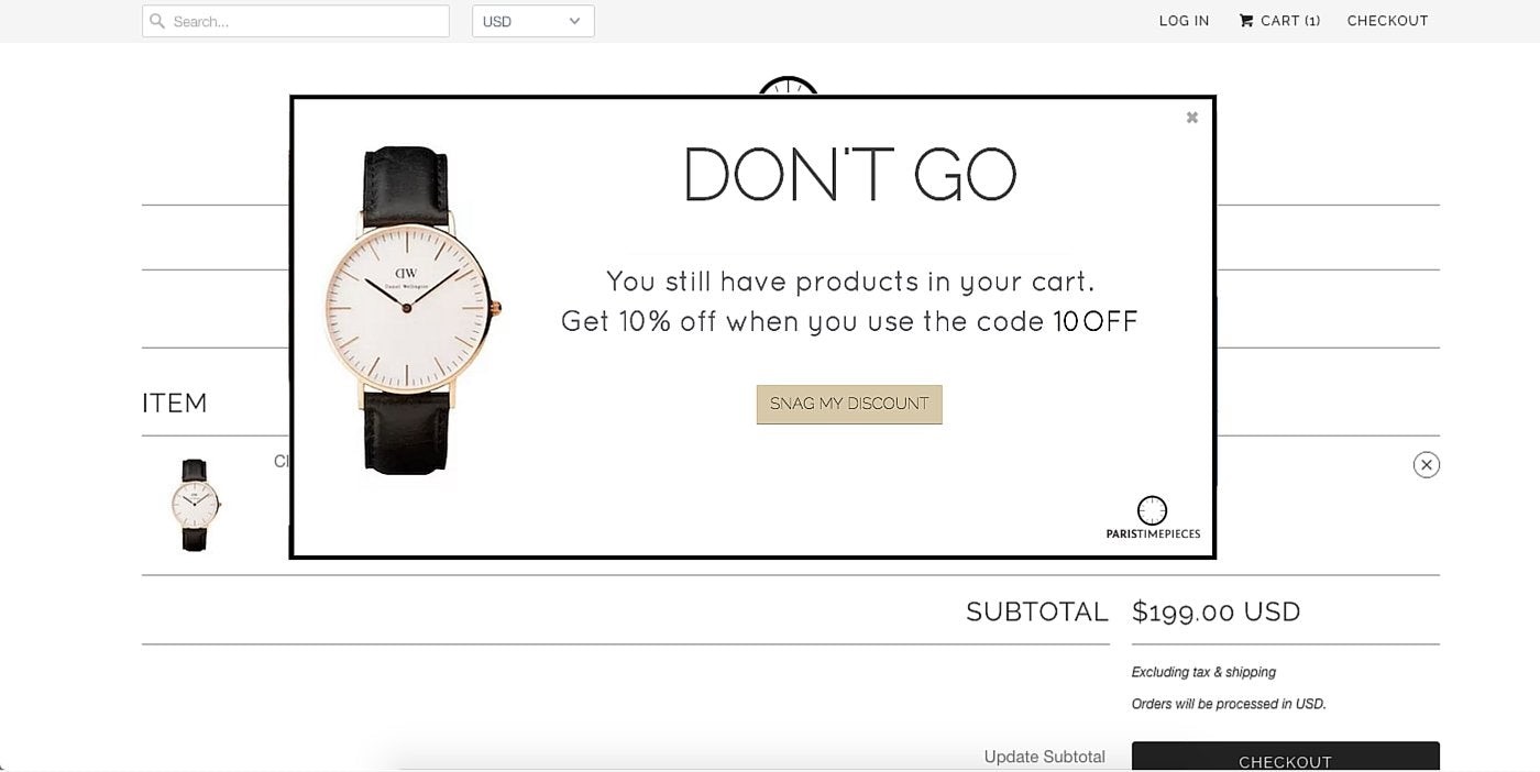
An exit-intent popup is like giving defibrillation to resuscitate the almost dead deal.
9. Clear Policies
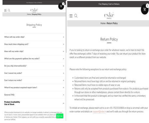
A lot of customers find a distinctive and carefully highlighted return and exchange policy admirable. Because today’s customers are already under a lot of hassles and stress, a hassle-free and detailed policy page with all the necessary details highlighted is expected from the website.
It gives them a sense of assurance which adds to the reliability quotient of your website. Here’s an example of Eske’s policy page.
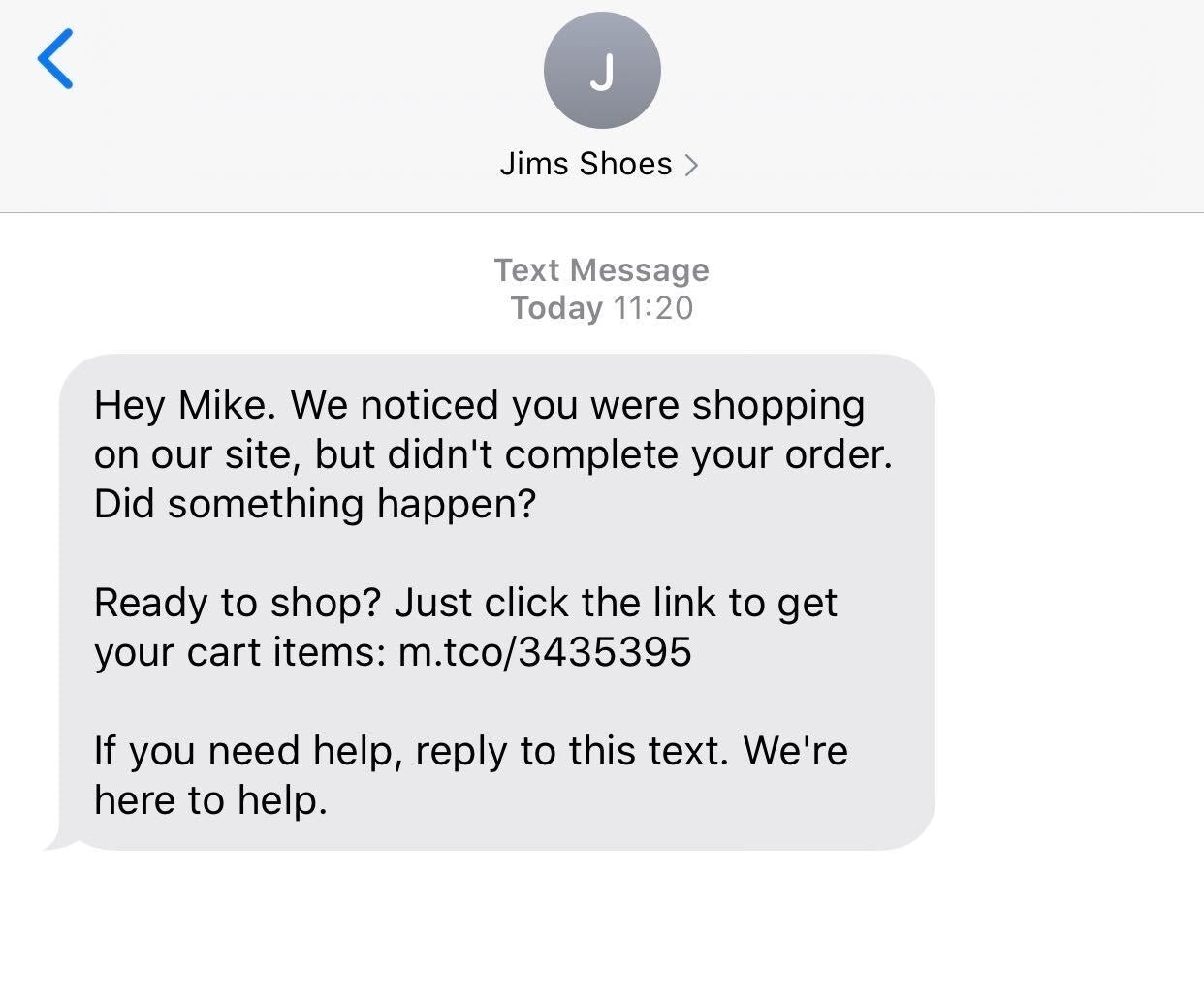
10. SMS And Whats App Reminders
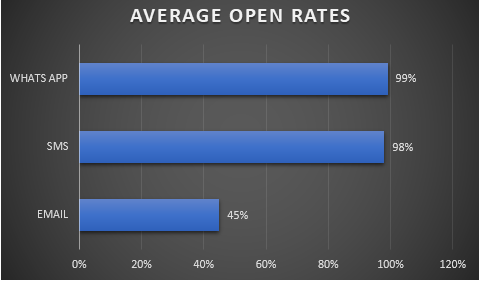
Although email retargeting, email being the most commonly used communication in e-transactions, is the key tool when dealing with cart abandonment, we must not forget other platforms like SMS and WhatsApp, considering these two are where the customers are readily available and have higher open rates. The average open rates of email, SMS, WhatsApp are represented below:
The content of the SMS and WhatsApp reminders is pretty much similar to email. The idea is to give them a sense of FOMO:
- What they are missing?
- Where they left off?
- What all they will get?
- How small the window of discount is?
11. Customer Service and Support
Pre-Purchase anxiety is not an e-commerce fable. Customers while selecting products online do get anxious because of questions like:
- Will the size fit me?
- Will it be delivered on written time?
- Will it be of the same colour?
If not rectified then and there, then the customer might not go through with the purchase. This is where your customer service and support can give you an unprecedented advantage.
You can provide your confused customers with the help they need with
- Informative live chats
- Widely diverse frequently asked questions option
- On-call customer service

In the end, it is all about keeping your customers happy and as lightheaded as possible while shopping. Shopping is therapeutic to many and if you cannot provide them with a smooth experience then they will abandon the cart.
Making their online shopping experience as personalized, smooth and real as possible is what will make your customers not only go through with the purchase but also come back for more.


